YouTube • Design • Canva
YouTube Thumbnail Checklist for High CTR in Canva
A thumbnail isn’t decoration. It’s a decision button. This simple Canva-friendly checklist helps you design thumbnails that look clear on mobile,
stand out in a crowded feed, and earn better clicks without looking messy.
People don’t “browse” YouTube thumbnails. They scan. Your thumbnail and title have about one second to answer one question:
Is this worth my click?
The good news is that high-CTR thumbnails usually follow a few consistent rules. You don’t need complex design skills.
You need a repeatable process. Canva makes that process easy because you can reuse layouts, fonts, and brand patterns without starting from zero.
Decide the promise in one short line. Not the topic the outcome. A strong thumbnail feels like a clear result, not a vague label.
The high-CTR checklist (keep it simple)
Good thumbnails are built for clarity. When you reduce confusion, you improve clicks. Use the checks below as a quick quality filter
before you publish.
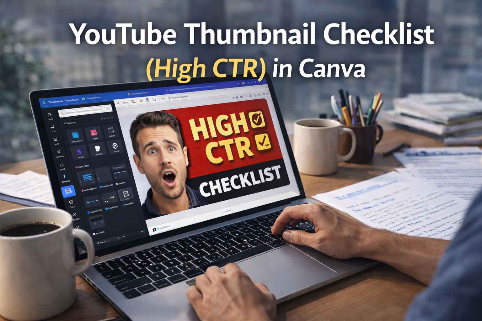
Mobile-first clarity
Most viewers see your thumbnail small. In Canva, zoom out until it looks like a phone-sized preview.
If the main message isn’t readable in two seconds, simplify the design. One strong focal point beats five small elements.
One subject, one message
High CTR usually comes from one clear subject (face, product, or key visual) plus one clear message.
The thumbnail should feel like a quick decision, not a poster full of details.
Short text wins
Keep text like a headline, short and bold. Aim for a few words, not a sentence. If you need a paragraph to explain the thumbnail,
it’s already too much. In Canva, increase font size until it stays readable even when you shrink the view.
Contrast over color
CTR improves when the subject and text pop. Choose a light background with dark text, or a dark background with light text.
If the text blends in, add a solid block behind it with slight transparency.
Clean composition
A simple structure looks premium: subject on one side, bold text on the other, and a small “cue” like “2026” or “CHECKLIST.”
Keep spacing consistent and aligned so it doesn’t feel random.
Support the title, don’t repeat it
If your title is detailed, keep the thumbnail short. If your title is short, the thumbnail can add one extra cue.
The best pair feels connected, not duplicated.
Canva workflow that makes thumbnails look professional
In Canva, consistency is your advantage. Pick one font pair and one accent color. Reuse one layout structure for a full month.
Over time, viewers recognize your style faster, and your thumbnails look more trustworthy.
If your subject blends into the background, add a subtle shadow or outline. This single change often increases clarity immediately,
especially on YouTube’s mixed backgrounds.
Make two versions. One with a face and bold text, another with the object and bold contrast.
Shrink both to mobile size and pick the one that stays readable first.
Export settings (so the thumbnail stays sharp)
Design at 1280×720. Export as PNG for crisp text. After exporting, open it on your phone and view it small.
If you can read it instantly without zooming, you’re done.